An ROC (receiver operator characteristic) curve is used to display the performance of a binary classification algorithm. Some examples of a binary classification problem are to predict whether a given email is spam or legitimate, whether a given loan will default or not, and whether a given patient has diabetes or not.
We may seek to develop a predictive algorithm to take some feature of the email/loan/patient and assign it a classification that corresponds to spam/defaults/has diabetes or that corresponds to not spam/does not default/free of diabetes.
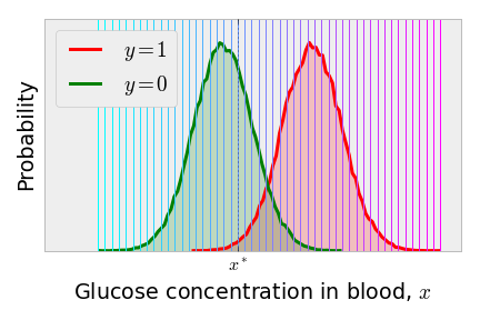
Consider predicting if a patient has diabetes on the basis of a quick, spontaneous measurement of the concentration of glucose in his or her blood, . Imagine that we know the true distribution of concentrations in the patients who have diabetes and do not have diabetes separately. It may look something like the following.
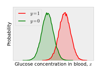
Because patients with diabetes are more likely to have a high glucose concentration in their blood, a simple classification algorithm is to label all patients with a glucose concentration above some threshold to have diabetes and all patients with a glucose concentration in the blood below to be free of diabetes. The value that we choose for making the classification is called the discrimination threshold.
Classification algorithm
if
if
Regardless of the discrimination threshold that we choose, we cannot perfectly separate those who have diabetes from those who do not on the basis of the glucose levels in the blood because of the overlap in the distributions. Some patients do not have diabetes, but ate some donuts before the test and thus exhibit high blood sugar; some patients actually have diabetes, but have been eating kale all week and thus exhibit low blood sugar.
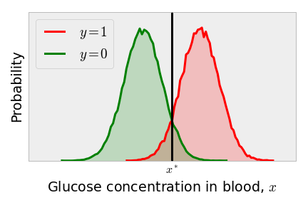
One might think that the obvious choice of the discrimination threshold is as shown below, since this equates the probability of a false positive to the probability of a false negative. As all patients to the right of the discrimination threshold are classified as having diabetes, patients in the green tail to the right of the vertical line are false positives. As all patients to the left of the discrimination threshold are classified as diabetes-free, the red tail to the left of the classification threshold are false negatives.
However, this discrimination threshold is the optimal one only if we consider the loss from a false positive equal to that of the loss when a false negative occurs. For this quick, cheap blood glucose concentration measurement, perhaps we should err on the safe side and move the discrimination threshold to the left. This way, we don’t let anyone who might have diabetes leave the hospital without further investigation to rule out diabetes. Decreasing the discrimination threshold reduces the number of false negatives substantially (the part of the red distribution to the left of the vertical line), as shown below.
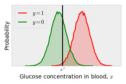
However, the reduction in the false negative rate comes at the expense of increasing the false positive rate (the part of the green distribution to the right of the vertical line). This incurs a cost: resources are wasted in the subsequent and probably more expensive tests given to these patients to rule out diabetes.
So, choosing the discrimination threshold is a trade-off; we must balance the false positive rate with the false negative rate.
The ROC curve nicely illustrates the performance of our algorithm by plotting the true positive rate against the false positive rate as the discrimination threshold is varied. This way, in the process of characterizing the performance of our algorithm, we avert the need to specify the loss that we incur when a false positive versus a false negative occurs.
The ROC curve for this example is plotted by choosing a series of discrimination thresholds , shown as the series of vertical lines below.
For each of the discrimination thresholds, we then compute the true positive and false positive rates using the Classification Algorithm above, integrating the appropriate tail of the appropriate distribution. The result is a set of points (one for each candidate ) in the true positive rate - false positive rate plane, which is the ROC curve. The points on the ROC curve below are color-coded consistently with the above series of discrimination thresholds.
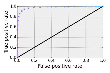
That’s the ROC curve.
A [poor] classification algorithm that randomly guesses if a given person has diabetes would have an ROC curve that hugs the diagonal line. You can see this by sketching a discrimination threshold on two identical, overlapping distributions.
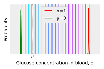
The ideal scenario for classification is when everyone with diabetes has the same, high glucose concentration and everyone without diabetes has the same, low glucose concentration. In this case, the ROC curve has a single point at [and two points at and , but no one in their right mind would choose one of these corresponding discrimination thresholds]. Below is a less exaggerated version. Most of the discrimination thresholds between the two, tighter distributions perfectly separate the classes and yield a point on the ROC curve.
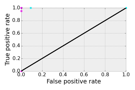
By considering these two extreme scenarios, we can invent a performance metric for a classification algorithm that does not require knowledge of the loss incurred by false negatives and false positives. Note that the area under the ROC curve in the perfect scenario above is 1.0, the area of the entire box; for a poor classifier, where the algorithm is randomly guessing, the ROC curve hugs the diagonal and the area under the curve is 1/2. This metric, the AUC (area under the curve), is commonly used to compare different classification algorithms for a given data set. One can compute the AUC by using the trapezoid rule.
In this toy example to illustrate ROC curves, we pretended that we knew the true distribution of for the two classes and that was just a number. More commonly, a classification algorithm, such as a neural network, takes a feature vector in a high-dimensional space and outputs some number that can be interpreted as the probability that the given data point belongs to class 1 (). The ROC curve in this scenario corresponds to the discrimination threshold on such that we map the set to a classification and the set to a classification . We can then compute the AUC of the neural network on a test data set to evaluate the performance of the classification. The discrimination threshold is now not a threshold imposed on the feature, but a threshold imposed on the model’s prediction. Still, the above ideas about trade-offs between false negatives and false positives hold.
Interpretation of the area under the curve (AUC)
We now prove that the area under the ROC curve is the probability that the classification algorithm will rank a randomly chosen data point, , that belongs to class higher than a randomly chosen data point, , that belongs to class (i.e., that ). We assume that the algorithm only predicts probabilities .
Let be the probability density function (p.d.f.) of predictions from our algorithm of all that are true 0’s and the p.d.f. of the predictions for those that are true 1’s. The true positive rate (TPR) and false positive rate (FPR) for a given discrimination threshold are the integrals of the tails of these distributions:
The ROC curve is the function and the AUC is thus:
We invariably obtain FPR = 0 as the discrimination threshold (effectively classifying all data points as class 0) and obtain FPR = 1 as the discrimination threshold (effectively classifying all data points as class 1). Let’s instead write the AUC as an integration over the discrimination threshold .
By the above equation for and the fundamental theorem of calculus, . The limits on the integral over the discrimination threshold are then from 1 to 0, since these thresholds tune the false positive rate from 0 to 1. Let’s also plug in the formula for .
Or,
where is the indicator function. Since is the probability density of the algorithm scoring a randomly selected class 1 example as and a randomly selected class 0 example as , we can see from this integral that the AUC is the probability that a randomly chosen point from class 0 ranks below a randomly chosen point from class 1. If the classification algorithm is performing well, the AUC will be closer to 1; a randomly guessing algorithm is closer to 1/2.
comments powered by Disqus