Imagine we are interested in the following chemical structure, which is composed of atom types oxygen (O), hydrogen (H), and carbon (C).
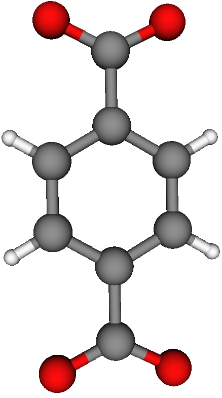
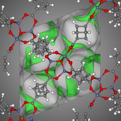
The colors of the atoms in the structure visualization, which I made in VisIt visualization tool, correspond to the standard colors used in JMol. A data visualization regarding the atom types in this chemical structure should utilize the corresponding colors for consistency.
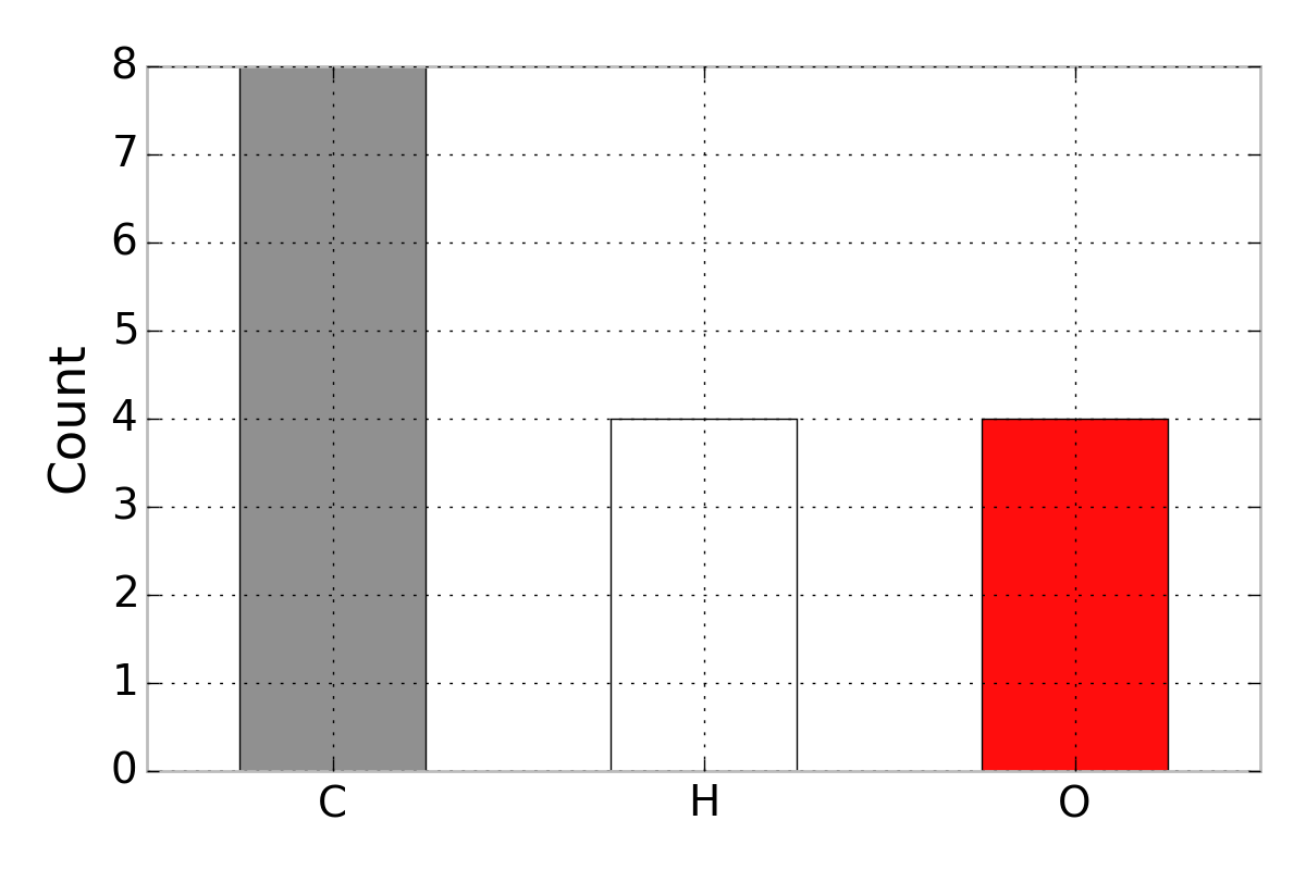
As a toy example, say we desire a bar plot that counts the number of atom types in the structure. We can make this in Python’s plotting library Matplotlib. What follows is a tutorial of how to make the colors in a Matplotlib visualization correspond to the colors in JMol. The final product:
A list of the RGB (red, green, blue) tuples that are used for the color of each atom is on the JMol website. I put a .csv of these colors on GitHub.
Using Pandas to load these RGB tuples into a DataFrame, I wrote a function that takes an atom type as an input and returns an RGB tuple that we will send to the plotting library Matplotlib:
import matplotlib.pyplot as plt
import numpy as np
import pandas as pd

# d/l here: https://github.com/CorySimon/JMolColors
df_colors = pd.read_csv("jmolcolors.csv")

def get_color(atom):
    """
    Returns RGB color tuple corresponding to atom

    :param str atom: symbol for atom
    """
    r = df_colors[df_colors['atom'] == atom]['R'].values[0] / 255.0
    g = df_colors[df_colors['atom'] == atom]['G'].values[0] / 255.0
    b = df_colors[df_colors['atom'] == atom]['B'].values[0] / 255.0
    return (r, g, b)

get_color("C")
# returns the RGB color tuple for carbon (0.564, 0.564, 0.564)
I created the data that we seek to visualize regarding atom counts:
df_toy = pd.DataFrame()
df_toy["Atoms"] = np.array(["C", "H", "O"], dtype=str)
df_toy["Counts"] = np.array([8, 4, 4])  # atom counts
To make the bar plot, we need to define the array of colors corresponding to the atoms in df_toy. We can do this with a list comprehension calling get_color():
colors = [get_color(a) for a in df_toy['Atoms']]Now, colors is a list of RGB color tuples corresponding to C, H, and O. We can pass this list of colors to Matplotlib to make the bar plot shown above:
fig, ax = plt.subplots()
ind = arange(len(df_toy['Atoms']))
ax.bar(ind + 0.25, df_toy['Counts'], 0.5, color=colors, edgecolor='k')
ax.set_xticks(ind + 0.5)
plt.ylabel('Count')
ax.set_xticklabels(df_toy['Atoms'])
plt.tight_layout()
plt.show()